Lighting your painting - 4 Ways to solve the lighting problem
text not complete and open to revisions
In this lesson, you´ll learn 4 ways to solve the lighting in your painting:
- Importance of the Plane
- Light Properties
- Light Set-up
- Material Behaviour
Fundamental #1: Importance of the Plane
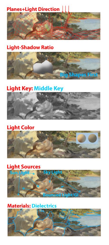
When painting and using light, switch from the form build-up approach to thinking about the right plane structure to make the right lighting decisions. As soon as you got the big shapes in start thinking in terms of smaller planes and continue to detail the painting, always thinking about and following the forms. If you can simplify the elements into the proper planes you will understand the structure better and you will be able to assign the right values(when lighting). The planes solve the problem of how fast something turns. Then imagine the location of the Light Source first and then shoot rays to the planes.
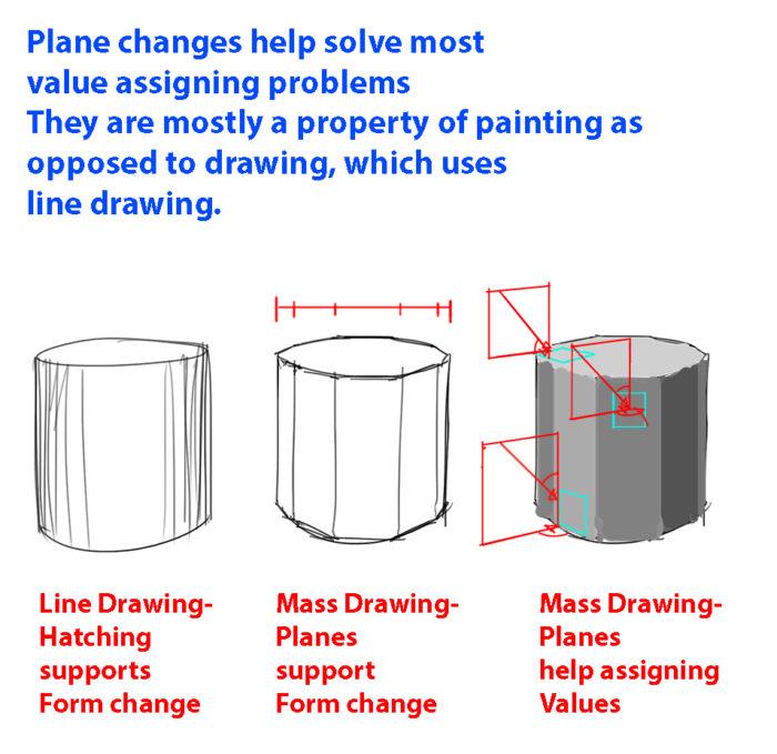
Plane Advantage #1
In painting, we don´t think in terms of lines and switch to the shape mindset completely, which is why thinking about plane changes will be neccessary. Because we think in terms of shapes, it will be easier to determine how light will have an effect on the value and colors. Always feel the form when painting(whether you paint diffuse or specular reflection). You can even ghost the structure first, like an insect crawling on the object, before putting in the final mark. This will ensure that you get a feeling for the form AND planes.
Plane Advantage #2
Plane Advantage #3
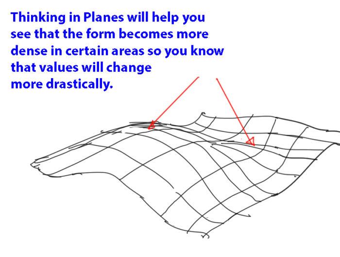
When our painting gets messed up, it is because we don´t follow a simple process to build up the lighting. Note that instead of copying shapes, you will be required to think and simulate the light situation. As anything it is difficult at first, but you will be able to do it if you practice it often enough. In the image below you can notice how thinking about the sphere will help you identify where the planes are located in 3-dimensional space and thus allowing you to light the plane correctly.
Plane Advantage #4
When starting to light your structure, there are only 2 basic things you need to pay attention to. First, the kind of light you are using in your scene and second the material it interacts with. Sounds easy? Let´s break it down further into actionable information so you can actually use these principles and paint. Instead of pure technical information like in 3D CG, you will learn about the physics behind it and it´s application in regards to value and color for 2D Painting. While the physics will help you understand things, I will also explain them to you in way in which they are ready to be used for painting. I recommend that you read this article multiple times as you practice. Sometimes we overlook things that might be crucial to make our paintings work. The main takeaway of learning the principles is it allows you to paint completely from imagination without boundaries, which gives you complete artistic freedom(however it is not always necessary to do so if you have real life or 3D reference).
Fundamental #2: Light Properties
There are some consideration to make when thinking about lighting. I will try my best to explain some of properties and explain how the lights affect the values and colors of a scene.
#1: Light-Shadow Ratio
The light-shadow ratio determines how much of a contrast there is between light and shadow. A higher contrast is created due to sunlight, and a lower contrast due to overcast weather for example. This is caused by different intensities in light. Different light conditions will make for different value keys. That´s why we need to pay attention to that. The ratio must be maintained consistently throughout the scene. It is enough to look at this with one material at first. If all elements in the scene have the same material, then all elements will also have the same ratio from light to dark. And that should be maintained consistently. Once you got this basic down, you can add more materials with different local values, which will also have a set of ratios that should be consistent to the light situation. Using multiply layer will maintain ratios between different local colors. Does the value in shadow become 40%, 10% oder 90% darker etc.(see image below)? The Light-Shadow ratio is calculated by comparing the key light with the fill light in photography. According to Loomis however, it is calculated by comparing key light with ambient light(flat base light in this case). Reflected is calculated separately in Loomis´ method. I prefer Loomis´ method, because it allows you to treat fill light separately. Using one of these methods will ensure that you are consistent with your light set-up and know what values to use. But don´t forget that it is a simplification as well.
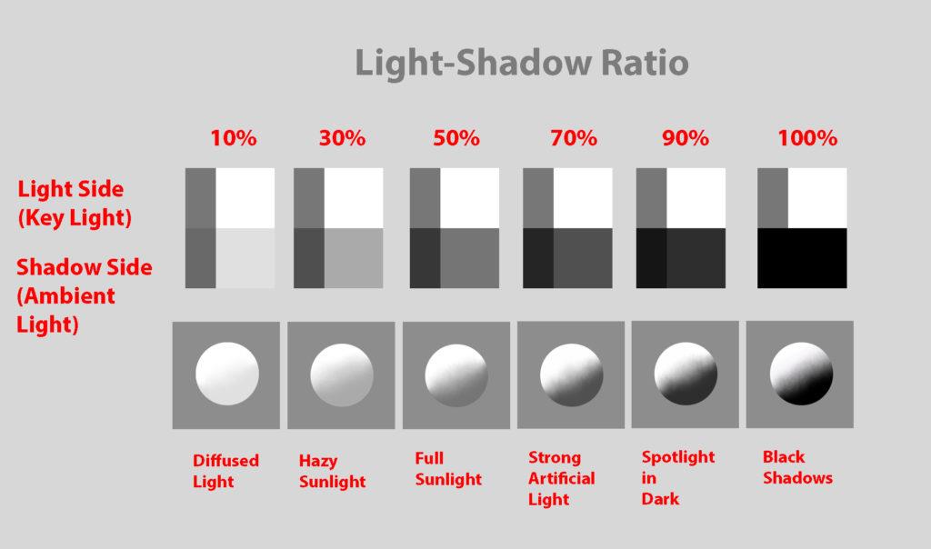
The Light-Shadow Ratio helps you quickly determine the overall value contrast to develop your scene.
After determining the Light-Shadow ratio you can continue determining the Shadow-Ambient Occlusion ratio, which also ideally has a constant value separation.
#2: Value Keys
Value keying is mainly a design technique used to adjust the value scale while maintaining the light-shadow ratio. Depending on the light situation we have a specific value key in the scene. Loomis gives us a some basic keys to choose from: High Key, Middle Key, Low Key, Full Scale, Dark against Light, Light against Dark
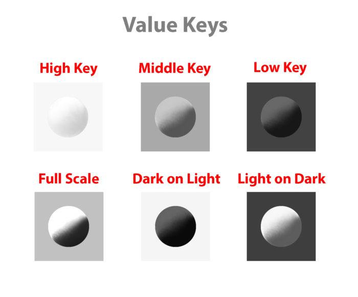
Value Keys are a great tool to design your scene.
#3: Value Compression
Value compression is needed, because we as painters can´t get the full range of light into our paintings. We need to decide, if we want to expose for the light side or shadow side and sacrifice the values on the other side. Watch the video for an explanation.
#4: Light Color
Now, it is time to approach color. First of all, thanks Mike Azevedo for his teachings about color. Of course, the fundamentals always stay the same, so what I show you here is very similar in approach. We have been looking at values and how to approach light from a value stand-point till now. Value Keys are a great tool to design your scene. The first thing to understand about light is that it constantly changes it´s wavelengths, therefore changing it´s color. When painting, what you want to pay attention in color is the relationship between the color of the object and the color of the light, just the same as in value. By color I mean the hue, value and chroma(the 3 properties of color). Comparing the hue, value and chroma of the light to the hue, value and chroma of the object, you can determine how the light affects the object.) To simplify the process just identify the light as a warm or cold light. What is often missed, is that diffuse reflection(color of objects) also has a temperature. It is also light.
Placeholder for light temperature vs color temperature Watch the video here for some more info on color temperature:
https://www.youtube.com/watch?v=XRAnoFX8MaM
Note that light hitting an object can be considered subtractive, which means that objects subtract from the lightsource depending on the local color and reflects the rest. What you also need to understand is that every color we have exists in a 3-dimensional color space and we navigate inside of it to determine the colors. This will help us understand the relationship between 2 colors, because both colors exist in the color space. Just as the scale from light to dark, there is also a scale from high chroma to low chroma and from cold to warm.
White Light consists of the Full Color Space.
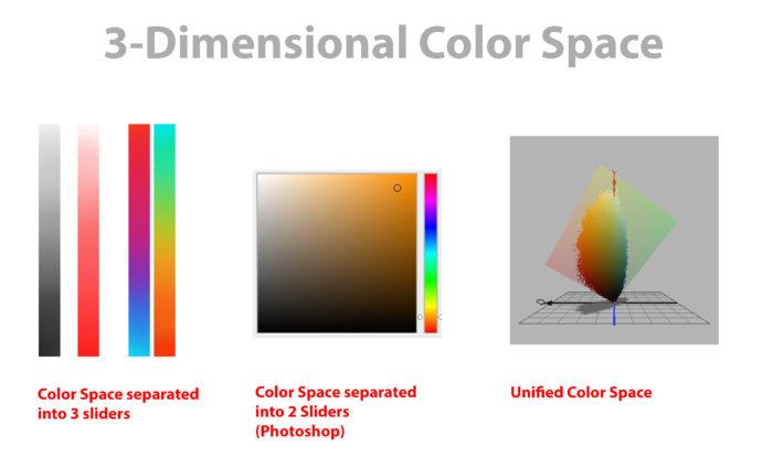
Here we have 3 representations of the Color Space. If the software allows we could navigate through a 3D representation of the Color Space(Credit Image to David Briggs at Huevaluechroma.com).
Just as with the light-shadow ratio in #1, here you need to determine the objects in ambient light first. It greatly simplifies the process. Using ambient light will allow you to determine the key of the light as well as show which colors the objects have. In a purely black scene we couldn´t identify the colors.
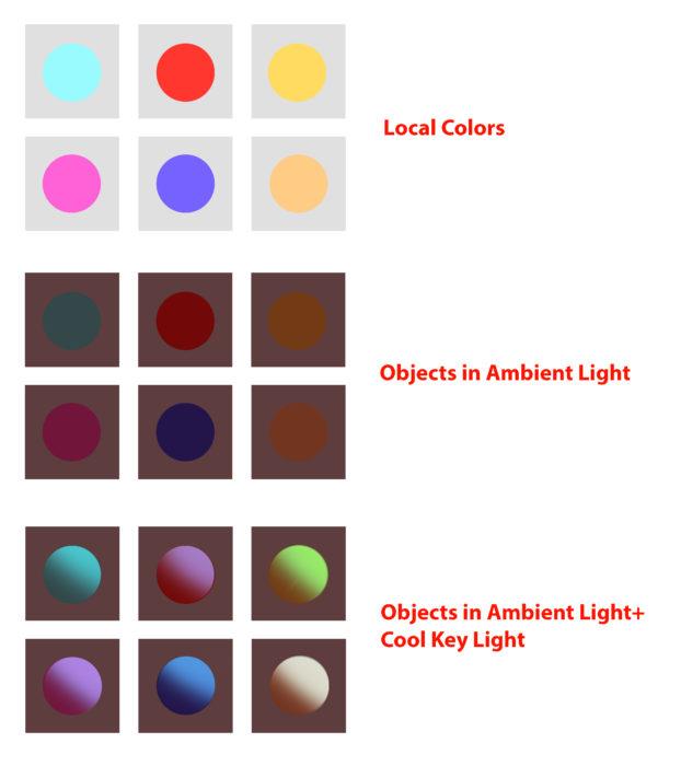
Objects are lit by the Key Light while still considering the restrictions of the Local Color
What is important in lighting is that an object has a specific local color with a specific color space and you can only know about that color when you put it in white light. While you don´t paint it in this process you should have it in the back of your mind and estimate how it is affected by the ambient light as well as the key light.
The Color Space of this Local Color is LIMITED(the diagonal is created due to the diagonal spread of the values)
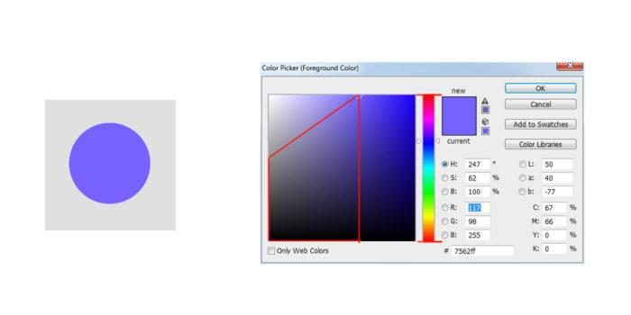
When lighting an object that is in dark ambient light, think about the color space of the local color and move the spot of the object color in ambient light towards a point in the space, where it is lit. For simplification, we can still stay with the same light-shadow ratio for values, because most colored lights still have a lot of white in them, even though it is scientifically incorrect due to the different absorbtion and reflection of diffuse materials. We are idealizing, designing and simplifying a process here. Monochromatic lights are fairly rare and they are a special case, which isn´t discussed here. So how do we know where to move the spots? Now, let´s look at the color picker. The color picker is a complete color space. In the example below you can see that we limit the color space by comparing both the color of the object(in ambient light) and the color of the light. The resulting color is somewhere inbetween the 2 colors(depending on diffuse and specular reflection). Notice how values, chroma and hue change and move from the color of the object towards the color of the light. Values are estimated by the light-shadow ratio and the chroma and hue change according to the local color. Depending on the amount of specularity, the color can almost completely move towards the color of the light(fundamental #4).
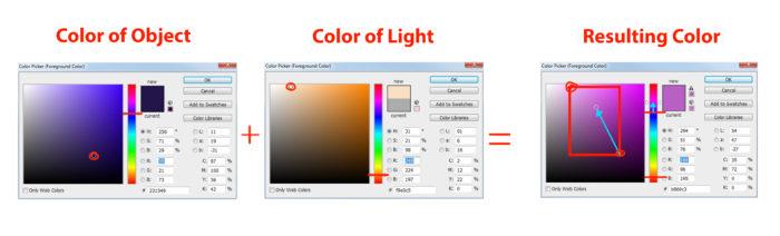
Due to the Limitation of both Color Spaces(Color of Object and Color of Light), the Resulting Color needs to be inside the Limited Color Space specified by the Red Rectangle and the two Red Borders. To simplify, the warm light temperature is turning the neutral blue of the object into a warm blue.
If the color is complementary, we can´t really adjust the hues relatively. The only option left is chroma. By making it less chromatic, we make the color warm or cool respectively. If we have a cool blue and make it less saturated, then it becomes more warm. Remember that both light reflecting off of an object and pigment mixing are subtractive mixing. In both cases we lose light in the process. When light falls upon an object, it is subtractive mixing, because the object absorbs the light and reflects the rest. If it was additive, the object would need to become brighter, but it isn´t. Additive mixing plays a role as well in painting, especially in methods of color mixing in real paints or when colors mix in our eyes.
TLDR: How does the temperature of the light affect the object? Depending on light and material behaviour the object´s hue, value and chroma are affected differently. You have some artistic freedom here, as long as the relative temperature of the object is consistent with the light temperature.
#5: Shading Components
Now that we have looked at color, let´s look at some of the shading components. By picking the right color you about smudging your painting. The painting becomes confident and -not- arbitrary. If you constantly use the eyedropper to paint then the computer might mix the colors in a wrong way. Notice in the image below, every physical effect can have it´s own value and color. This way your painting gets organized and you ultimately always know what you do. I didn´t use the eye dropper to paint in the shapes. Only use the eye dropper to pick those base colors to paint with or only if you are sure that the color wouldn´t get derivated. I really don´t like the term “swatches”, because painting isn´t about color formulas, but about picking the right value and color that fits it´s physical effect. For every painting the values and colors change depending on the light situation.
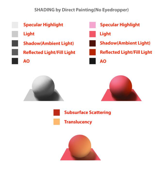
Every physical property can be assigned a separate value and color. This will greatly simplify your process.
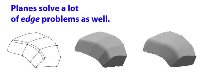
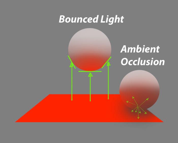
Reflected light indicates that there are other objects in the scene. It is the only way that you can add value gradations to planes in a direct light setting, which makes the scene way more livelier and realistic. Reflected or Bounced light has a significant effect on a lot of plane surfaces. It also helps us showing plane changes when we need them to make the form clear. Ambient Occlusions are areas, where no reflected light can reach. In a sense it is the opposite of reflected light. The same way shadow is the opposite of light. It is logical that ambient occlusion happens mostly in shadow. If direct light would hit the edge of two walls, then the direct light reaches that area 100%. No ambient occlusion can happen there, because it is the absence of light. Halftones Every physical property can be assigned a separate value and color. This will greatly simplify your process. When you render Halftones you actually render all these subtle plane changes by using subtle value changes. They are the diffuse reflection of the object. Changes in values can be very subtle especially if you render objects realistically. When I say very subtle, I mean that the tiniest of value changes should be taken into consideration. These can be changes due to plane changes or due to light changes. There is a reason Sargent would render the halftones first. He wants to make sure, that the big planes and the big light relationships are painted in first and only then continues to paint the details, which are just smaller planes. So start with the big shapes first, so you can create bigger structure first, just as we transition from simple boxes to detailed drawings. This method would ensure that you can control the shapes better. Not only from a structural standpoint, but also from a compositional standpoint. It goes from simple to complex and will make your life easier. If you render things plane by plane the process can be very tedious and have a laboured effect, and you might even have to repaint certain areas. Also, you can be sure that the more you model the halftones and the more complex the structure gets, the more detailed and rendered the final product will be. In a painting the Halftones should be considered the Light side, which is then separated from the Shadow side. So at any given time render the Halftones separate from the Shadow side. You can do this by: 1. Rendering the Halftones first(before painting the Shadows) or 2. Paint on Lighten Layer to only affect your Lights.
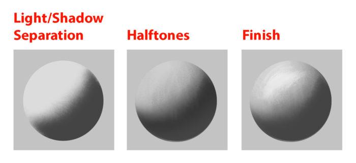
Light/Shadow Separation, Halftones and the Finish are all crucial to the painting workflow.
Highlights Specular Highlights are just specular reflections that come from the light source. Another kind of highlights, the Form Highlight is the lightest point of the diffuse reflection it is perpendicular to the light source.
Fundamental #3: Light Set-up
Now that we know how values and colors and affected by light, let´s look at how to set up lighting situations. These lighting situations are always used, and can be divided into natural and artificial light.
#1: Light Types
There are only 3 basic light types you need to know to light your scene. Key Light, Fill Light and Rim Light. In #2 you will learn about the light sources. Light sources can all function as one of those 3 light types.
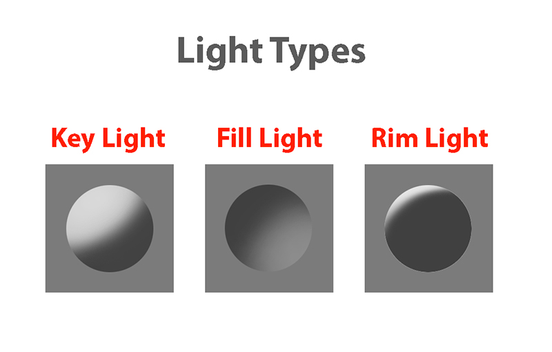
Light/Shadow Separation, Halftones and the Finish are all crucial to the painting workflow.
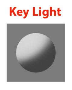
Key Light Key Light is the main light and brightest in intensity. It can be the sun or a strong direct light from an artificial light source. Key light is mostly hard in quality, but it can be soft as well. It is possible to use multiple Key Lights to create special light situations.
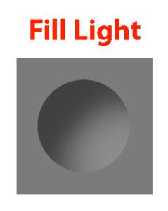
Fill Light Fill Light is a secondary light source and acts just the same as the the key light and it can be treated exactly as that, except that the intensity is lower, so the value contrast is not as high with this kind of lighting. Full Light might be created by Reflected Light, Sky Light or a soft Artificial Light source. When rendering using fill light you should still think about the direction of the light(which is often missed).
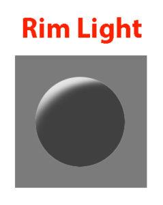
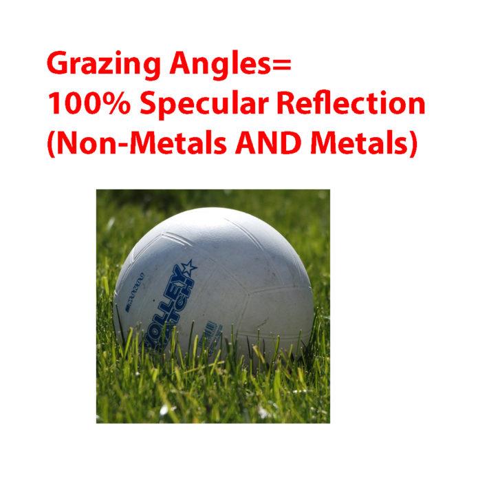
Rim Light Rim light is light lit from behind. It effectively uses the Fresnel effect to produce a strong light effect. All types of materials become 100% reflective at grazing angles, which is why this works so well.
#2: Light Sources
There are only so many light sources that exist. Knowing about them will help you identifying them in any given reference and use them creatively.
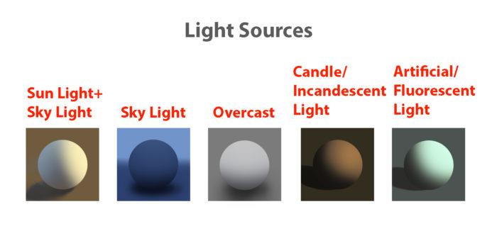
There are only so many Light Sources. Identifying them will let you understand the scene.
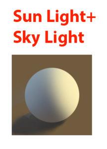
Sun Light+Sky Light Sun Light is a Direct Light and is hard in quality, so it will create hard shadows. The Sky Light is cool and acts as a Soft Fill Light.
Sky Light The sky is a light source that is always used as a light source in outdoor settings, so knowing it´s light properties will help you understanding most light situations.
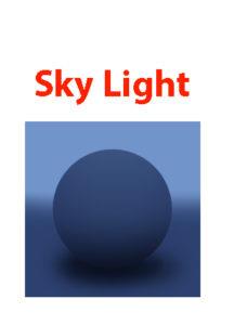
Rayleigh Scattering creates Soft and Cool Light.
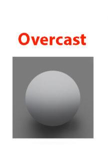
If your painting is mostly in shadow then the Sky Light will act as your primary light source. It is low in intensity, soft in quality and cool in temperature. Depending on the time and place, the light can change quite a bit. The Rayleigh Scattering creates Soft and Cool Light. color and softness is created due to Rayleigh Scattering (light changes it´s wavelengths due to the particles in the air, so the color of the sky changes depending on time of day). Overcast Overcast Situations are just like the Sky Light soft in quality. Due to the Mie Scattering(scattering through clouds) the softness is created while retaining a neutral temperature.
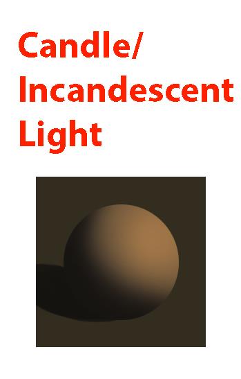
Candle/Incandescent Light The special property of candle and incandescent light is it´s very apparent Fall-Off of light. These light sources lose a lot of energy because they need to cover a bigger space(spread) as the distance increases. The rules for this is called inverse square law, which states that light of a point light source weakens at a rate of the square of the distance between source and surface(Just look at the image to understand).
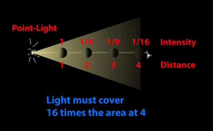
In a painting this would make for dramatic value changes and the intensity of the light on the object varies depending on the distance of the object to the light source.
The effect can´t be seen for sun light. Sun light travels so far, that we don´t notice any fall-off in our spaces(our space distance is nothing compared to the distance from sun to earth), just as we don´t look at the sun as a point light source. So you don´t need to apply fall-off to sun light. However, in the evening light might fall off due to scattering.
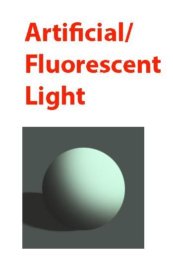
Artificial/Fluorescent Light Artificial/Fluorescent Light can have a variety of colors and intensities. In most cases it is used in fairly dark settings like night scenes or dark rooms.
#3: Global Illumination
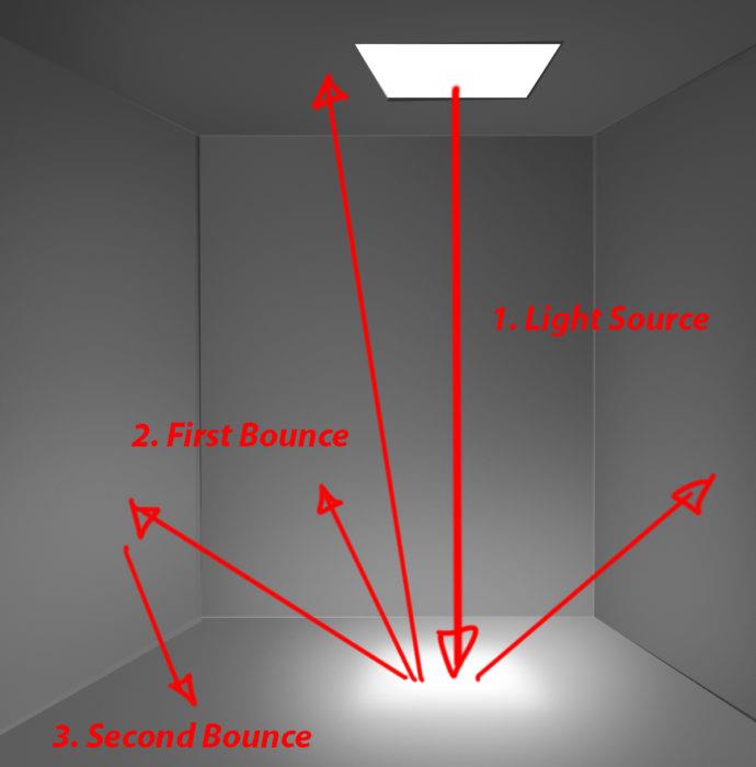
The characteristics of global illumination is the use of bounced/reflected light. It is used to calculate where reflected light is coming from, so we know which planes receive what light in any given scene. You need to treat it as a diffuse light source. It is most effective when there are a lot of shadows. Start with identifying the light source and then follow the light rays and see how they bounce off of the surface. Keep in mind that the light will lose in intensity as it travels farther away. Reflected light should be treated as diffused light first and second as low-intensity light sources. Opposed to that you can treat areas, where not a lot of reflected light reach as ambient occlusion(AO). AO is the opposite of bounced light. AO is calculated by using rays coming from the surface to see which surfaces it hits. The more surfaces it hits, the more occluded the area is. If a lot of rays are unoccluded and reach a light source, then that area is well lit. The term ambient light is used in CGI as a flat value and it used above to determine the light-shadow ratio. Global illumination would be the correct method in calculating reflected light and ambient occlusion and it can be used to support the Ambient Light(in an idealized setting).
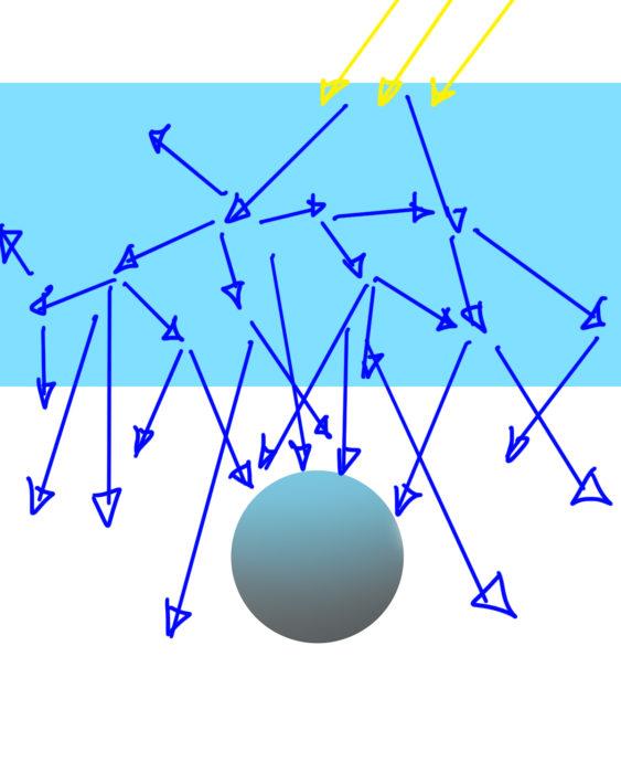
Example #1
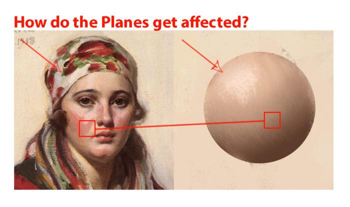
The Plane that faces the light source directly gets the most photons thus becoming lighter, while planes that are angled to the light source get less photons. Due to the diffused quality of the light, the photons hit the ball more evenly. The Ambient Occlusion can be determined by shooting rays to see how much occluded it is by the structure.
Example #2
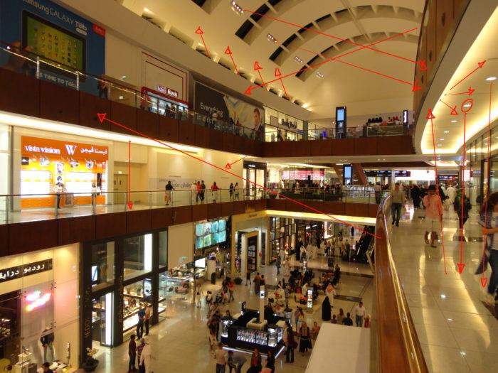
Start with identifying the light source, and then simulate the bounces thinking about the distance the light rays travel around. You can see that the ceiling receives less light in this example.
Example #3
Practice Global Illumination by studying photos and see how the light interacts with the environment. Start with the light source and continue to simulate light bounces. It doesn´t need to be perfect, but you should find a reason for the lit areas.
Fundamental #4: Material Behaviour
Many Material renders disregard the properties of Light. The reason we have learned about light in the first place is to convey materials in different lighting conditions and make them congruent to the scene. Let´s look at the materials and how light interacts with different surfaces. First
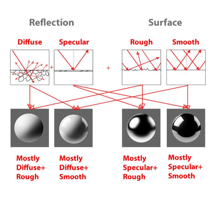
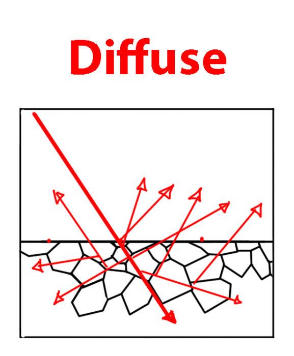
First of all: Everytime you place a light, you will need to take into consideration two kinds of reflection(not one), which are: Diffuse Reflection Practice Global Illumination by studying photos and see how the light interacts with the environment. Start with the light source and continue to simulate light bounces. It doesn´t need to be perfect, but you should find a reason for the lit areas. In diffuse reflection the light is reflected off the a solid surface. The light actually reflects off of scattering centers beneath the surface and then reflects off the material. Unlike often mistaken, a diffuse reflection is not due to a rough surface, but due to the scatterning directly beneath it´s surface. Diffuse materials absorb the light and turns it into heat. The reflected light will appear to have a certain color. White materials for example reflect almost all of the light back. Due to the absorbtion of diffuse surfaces, we lose a lot of light, which results in the albedo color(the color of the reflected light).
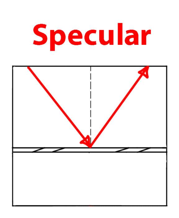
Specular Reflection The light reflects almost all of the light source when it is reflective, which is why the light in reflective surfaces are stronger. As a general rule, the rendering of the speculars should be treated seperately from the diffuse reflection, so that you can have a proper organization of the effects. First learn to plot these reflections and then most importantly simplify so that it enhances the design. We can plot it accurately, however all the details in the reflection don´t help the design. There are some simple rules to specular reflection: -the amount of specularity is determined by the IOR(Index of Reflection) -reflects the environment -sometimes has specular color -loses a certain percent of light If the material is glass or has a diffuse reflection, then only light that is lighter than the value underneath can be seen.
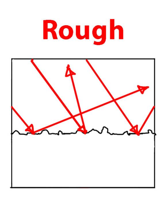
Additionally we will have these two surface properties for each material: Rough/Matte Surface A rough surface has a lot of bumps that will make the light reflect unevenly off of the surface. Any specular reflection would become softer and would probably lose some of it´s intensity.
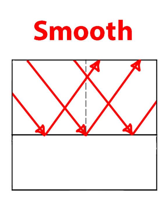
Smooth/Glossy Surfaces The material of a smooth surface is even and any specularity reflects perfectly back.
Metal vs. Non-Metal Generally we can break down solid materials into metals and non-metals, because they have both the extremes of diffuse vs. specular respectively. The majority of objects we see in life are matte surfaces. That´s why it is crucial to understand matte surfaces first. The color of the metal comes from specular reflection as opposed to diffuse reflection. Instead of going into the surface first, the light directly reflected and tints the specular reflection to the color of the metal, which is also due to absorbtion of light(the physics behind this seem to be pretty complex). Metals don´t have any diffuse reflection, which is why you can treat them as black diffuse. Metals can have rust or dirt though, which will make the metal treated as dielectric materials. Metals have tiny mirrors on their surface, which might make the highlights softer. The light is intensified on it resulting in highly saturated or high reflection of the light source. Characteristic of metals are the free electrons which cause the light to reflect. These free electrons are not available in non-metals. The reflection is intensified due to the focusation of the photons, which makes the highlights so intense. Colored metal will reflect light intensely with high saturation due to the amount of reflected protons(?) Non-Metals(Insulators/Dielectrics) Non-Metals have a low reflectance value for F0(Fresnel Reflectance at 0 Degrees) of 2-5%, so it is hardly noticeable. But again, as the angles turn towards 90 degree it can become 100% reflective. Certain liquids and glass have also a reflective surface as metals.
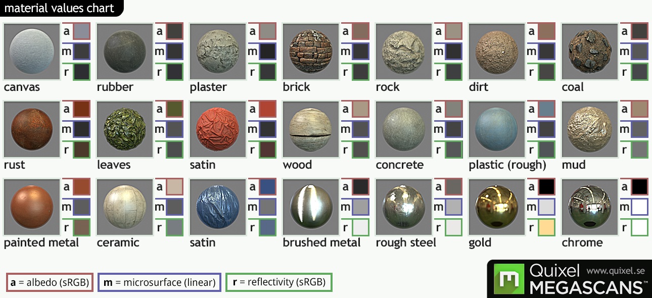
This chart shows us some “values” for the diffuse(a for albedo), specular(r for reflectivity) and the surface(m) and serves as a great reference when finding out about the properties of a material. MEGASCANS by Quixel(With friendly permission by Quixel)
Fresnel Again, every object has some kind of specular reflection. Depending on the viewing angle, we see varying amounts of reflected light. The amount is specified by the index of refraction(IOR) and also the fresnel reflectance at 0 degrees(F0). The IOR describes the amount of refraction of a material at F0. F0 describes the amount of specular reflection, when light hits the surface perpendicular to the viewer. While we can divide into matte materials and reflective materials, a better division would be Low-IOR materials(non-metals) and High-IOR materials(metals). Low-IOR materials reflect less, while Hogh-IOR reflect more at F0. The strong light we see in Rim Lights is effectively specular reflection made possible by the fresnel effect. When we look at mountainscape, some of the specular reflection is apparent as well, if the surface us at grazing angles. At F0 the fresnel effect doesn´t have a lot of impact on non-metallic materials as usual.
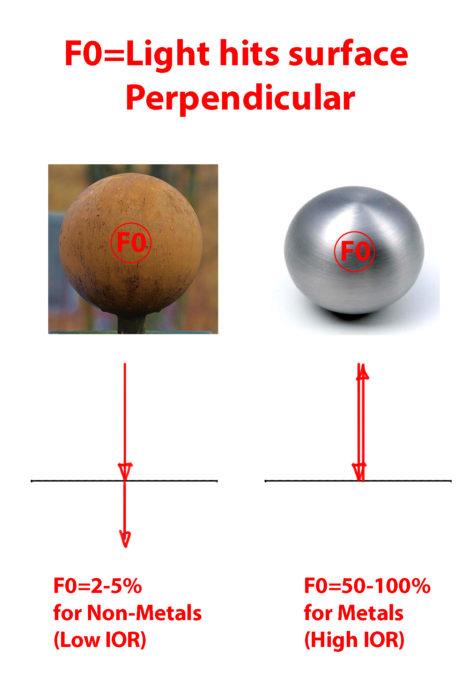
At F0, the Specular Reflection is less apparent. The amount depends on the type of Material.
Specular Reflection at Grazing Angles
Enery Conservation This one is quite important if you want to calculate the right rate of diffuse and specular reflection. The way materials work is when a material reflects a high percentage diffusely, then it can´t reflect much specularly. The same way that when a material reflects a lot specularly, it cannot reflect a lot diffusely. This is due to the conservation of energy. At F0, the Specular Reflection is less apparent. The amount depends on the type of Material. Specular Reflection at Grazing Angles Let´s say our Light has the enery of 1. The material reflects 0.8 of the light diffusely. That means that the light can only reflect the light with the rest of the energy, which is 0.2. The specular reflection can´t be higher than 0.4.
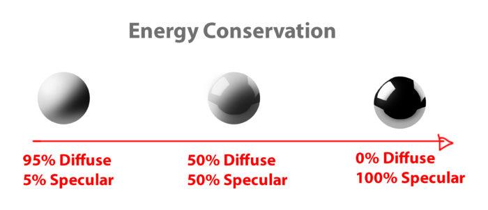
Values need to be congruent with the energy distribution.
Multilayer Materials The Diffuse+Specular workflow works better because materials might have multiple layers. Simply using the Albedo+Reflectivity(Metalness) workflow wouldn´t work well with multiple layers due to the differences in color and reflections.
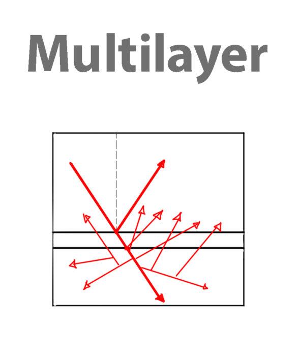
Specular Layer Above, Diffuse Layer beneath.
Concave vs Convex Reflection Depending on the surface curvature, the reflections squash or stretch. This is the reason, why highlights tend to differ in size and proportions as well.
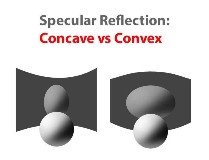
The reason why some Highlights and Reflection are stretched are due to the distortion of the surface.
Anisotropic Reflection I would like to include anisotropic reflection, because it is pretty common for materials like metals, hair and water. They are created by directional unevenness on the surface. What happens is that the specular reflection distorts towards the direction of the surface.
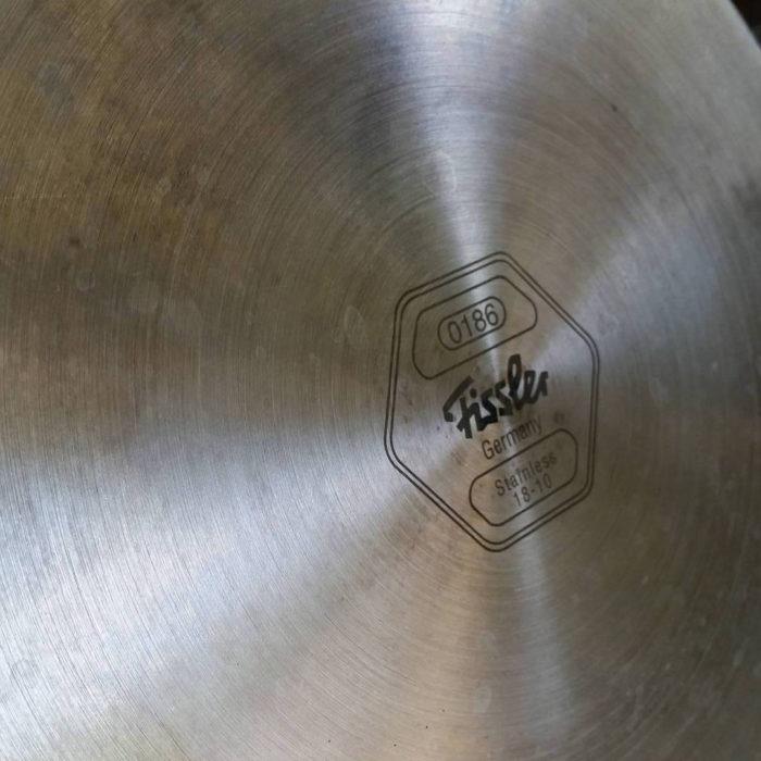
Anisotropic Reflection on the bottom of a pot.
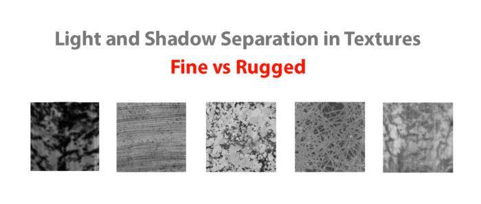
Texture The reason why some Highlights and Reflection are stretched are due to the distortion of the surface. Anisotropic Reflection on the bottom of a pot. The texture describes the light on materials. Depending on how the light is hitting the texture surface, we can use texture brushes to simulate that effect by using the right values and colors. Just as a bump map in 3d we can use different texture brushes to create some rough surfaces. What you can do to study the texture and replicating them is simple. First study what forms and shapes the surface has and then using the right values to paint the light and shadow of these surfaces.
Use different values and Brushes for Light and Shadow Patterns of the texture. Building the Halftones will make it easier.
Atmosphere Atmosphere is created by many air When you think about the atmosphere, think abut the planes of the structure first. And then determine how far the planes are from the viewer. The farther it gets, the more the structure turns into the color of the atmosphere. Thinking in planes in 3-dimensional space will help you avoid the flat look of atmosphere. Think about where the atmosphere might become thicker inside the space.
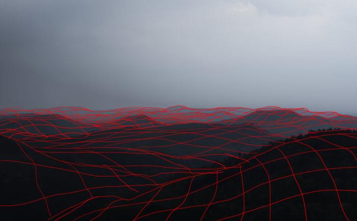
Planes showing the structure of the Mountains. Atmosphere
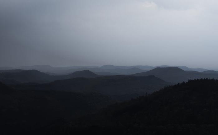
Atmosphere affects the Mountains depending on how far the planes are from the viewer.
Conclusion
Anders Zorn – Bather with Parasol, Dalarö; Study the Masters to Strengthen the Principles. Try to think about them next time you are doing a painting.
Of course being able to see is not just a matter of understanding physics, otherwise every physicist or photographer could paint. Learn how to think about shapes, value, color and edges and understand it to apply the knowledge of physics to adjust your values and colors. A proper artist knows both the mechanics of painting and of physics. Every physical effect can be boiled down to a simple “rule” that you can apply into your own painting. If you are struggling with rendering something, just go back to this article or do some research on physics and you will understand how it works to apply to your painting. My next article will talk about the big picture of painting. It will put everything that is written on FoP in proper perspective and gives you a guideline for a possible path as an artist. In fact, learning to paint is achievable and shouldn´t give you too many headaches.
Further reading
https://en.wikipedia.org/wiki/Diffuse_reflection https://en.wikipedia.org/wiki/Shading http://de.slideshare.net/RenaldasZioma/unite2014-mastering-physically-based-shading-in-unity-5 http://www.neilblevins.com/cg_education/reflection_highlight/reflection_highlight.htm http://www.neilblevins.com/cg_education/aniso_ref_real_world/aniso_ref_real_world.htm http://www.huevaluechroma.com/ http://www.alexhays.com/loomis/ https://www.allegorithmic.com/pbr-guide https://www.marmoset.co/toolbag/learn/pbr-theory http://www.marmoset.co/toolbag/learn/pbr-practice https://www.youtube.com/user/kingkostasart/videos