Painting principles applied - the study of a master painting
This lesson uses various painting principles to study a master painting by John Singer Sargent.
#1: Nature and Master Studies
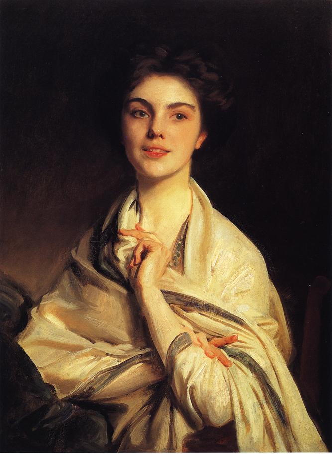
1. Nature The above painting by Sargent is the one we are going to analyze. First of all, you can see that this is a painting of something that exists in real life. Why should we do the same? Can´t you just paint from imagination? Everything you know, even your imagination is created by things you have already seen. That means, that everything you create is informed by nature and becomes better the more you know about it. Nature is the source of all knowledge and nature is life.
2. Master Studies We can not choose our taste, but we can develop it. If you want to develop your taste, you should look at a lot of master paintings. The above painting is a great study of nature, but at the same time it is a work of art due to it´s expression. When talking about taste, I´m not talking about the tools of expression, which are learnable by training. We will look at these tools of expression in #3. Master paintings are just great examples of what is possible. They are truthful representations of how we see, unlike photographs. At the same time you can study master paintings for their technique and their whole thought process. To study both nature and masters though, you need 2 different ways of study:
- The Study of Accuracy and
- The Study of Rythm.
#2: Accuracy and Rythm
In spotting mistakes in your own paintings, accuracy and rythm are the two major things you need to look out for. Problems of anatomy and perspective are problems of accuracy. However, if your painting lacks “impact”(does it look boring?), then it is due to the lack of rythm to create expression. Even in any given critique you will get from peers, it is either about the accuracy or rythm. Let´s look at Accuracy first.
#1: Accuracy
First of all, if there is any impression we see, we need to be able to represent it accurately. How can we expect to paint something from imagination, when we can´t even paint it, when it is right before our eyes? This is the first step: To paint what we SEE accurately. Accurately representing what we see is still a problem for beginning AND professional artists, because accurate representation requires sheer concentration and knowledge of the painting properties at hand. That is not to say to copy mindlessly, but to still always have a mental image and know what you are doing and do it with purpose. Accuracy is basically what we learn in Ateliers the majority of time. As in the previous article, we looked at the division of Form and Shape, and in Accuracy you can tackle it from either way. But because we are so used to Drawing(and the connection of Touch to Sight) as opposed to Painting, we should practice from a Shape point of view. Here are the 4 elements to study accuracy:
Study Approach #1: Comparison of Shape Relationships
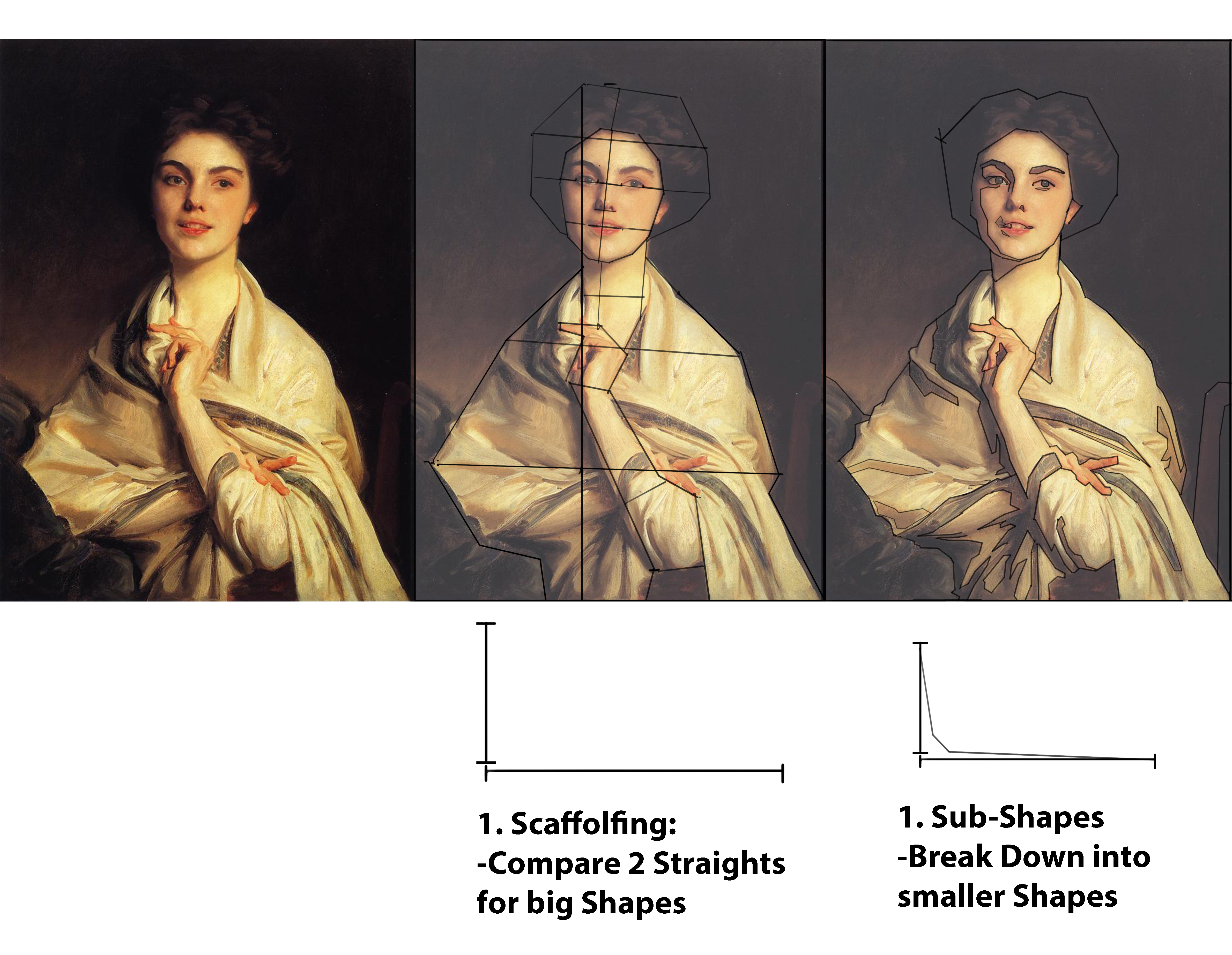
Start with comparing big shapes first and compare the lengths one to another. How long is one length compared to another? Pay attention to negative and positive shapes and consider the image as a whole(the canvas in itself is the biggest shape).
Study Approach #2: Comparison of Value Relationships
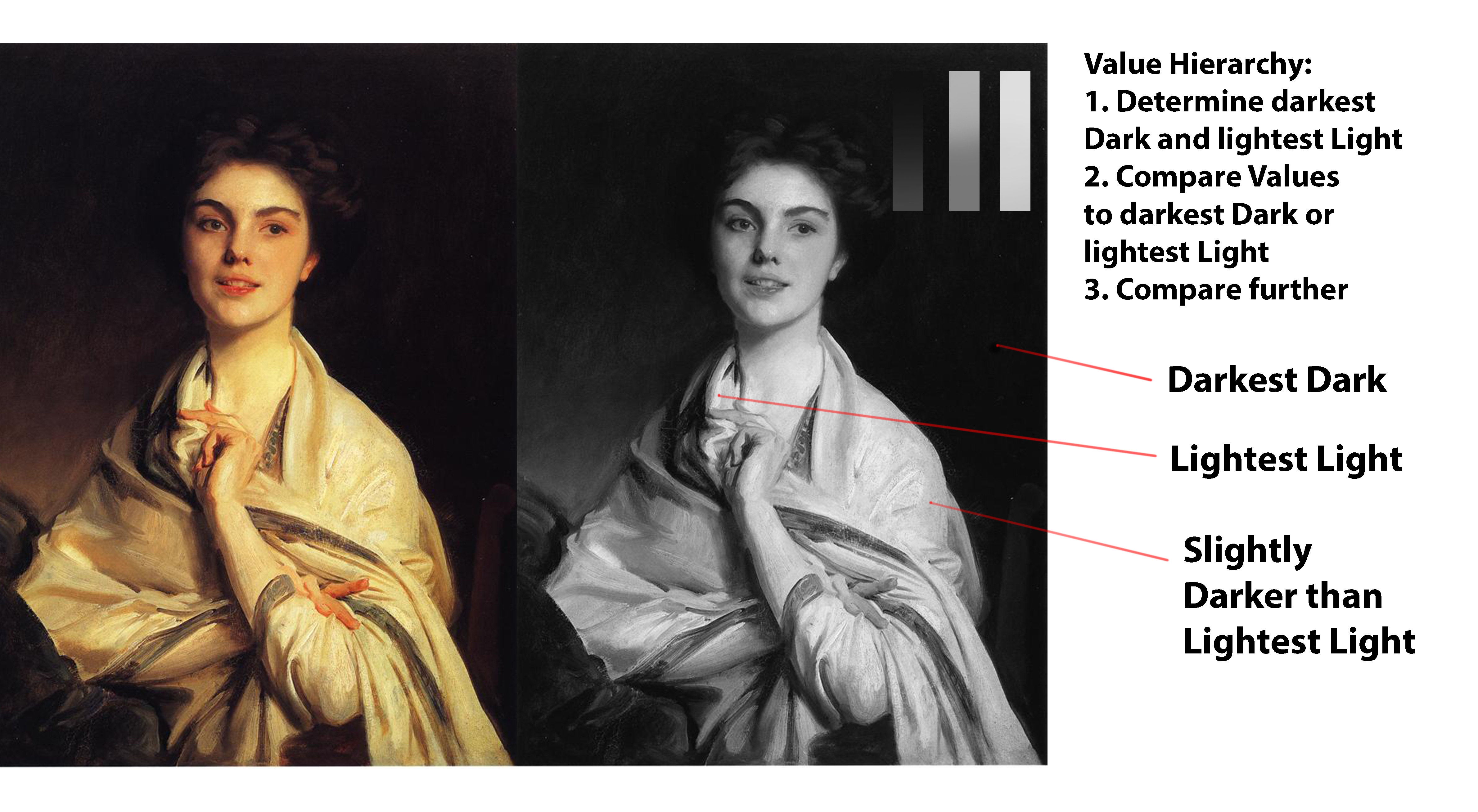
Again this is all about comparison. Identify the darkest and lightest values first and then compare everything one to another. Remember to squint to keep things simple and see the relationships better. While relative comparison is good, you can also identify them on a value scale as numbers from 1-10(especially when using values for value patterns(see #3: Rythm)).
Study Approach #3: Comparison of Edge Relationships
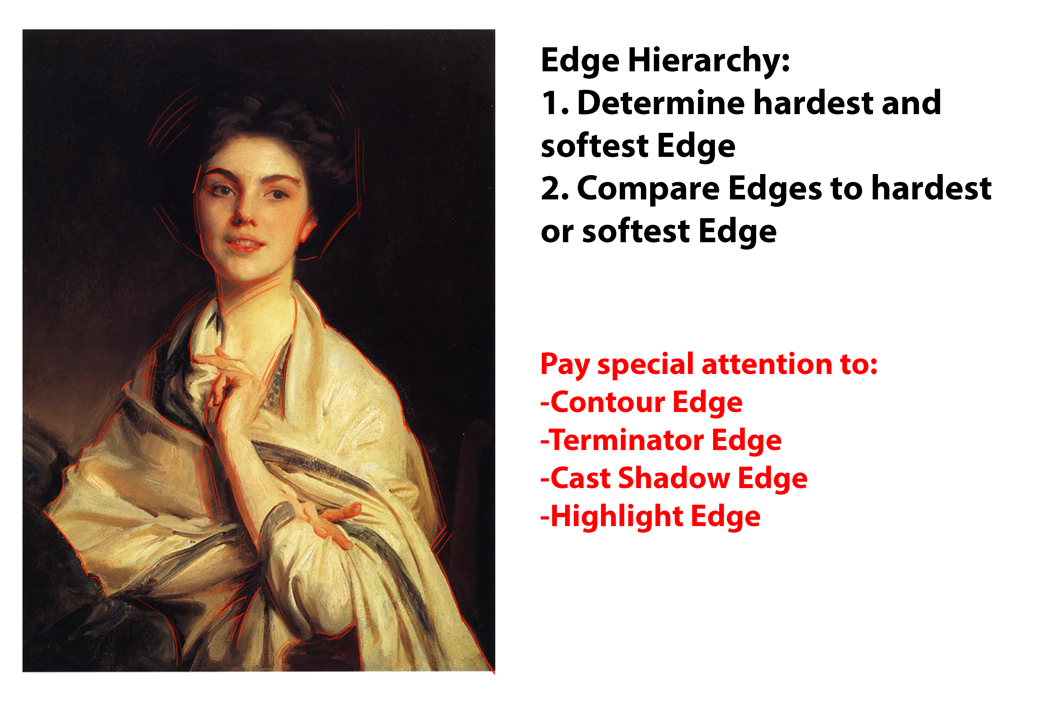
If you understood the concept of shapes, you will have no problems identifying the edges. Again, just by comparing relationships you can see a hierarchy of these edges.
Study Approach #4: Comparison ofolor Relationships
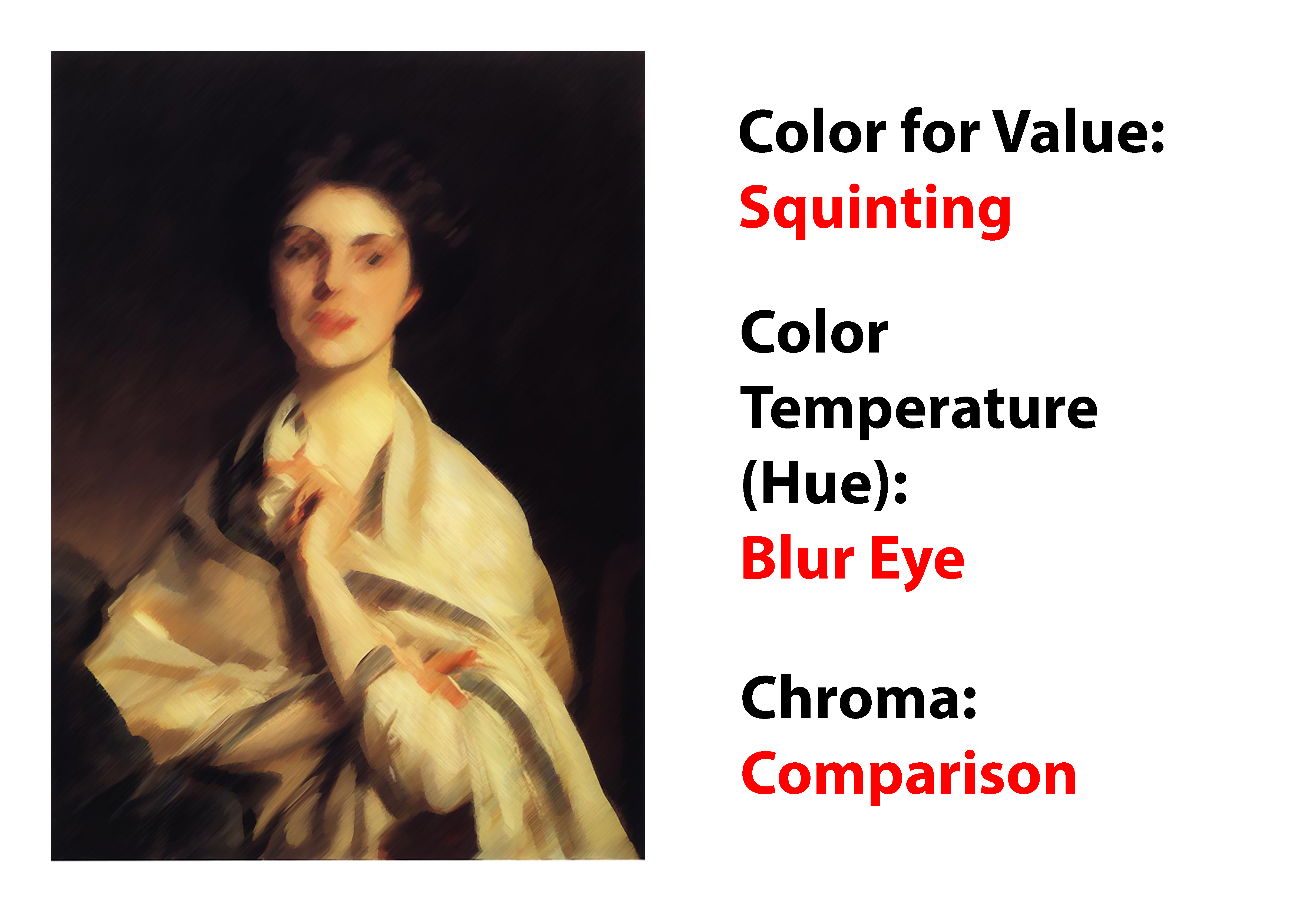
Color itself consists of value, hue and chroma. It can get more complicated very fast, but for now remember the following: 1. Color for Value: Any given Color can be seen as a value. It is helpful to identify them as a value between 1-10. It is easy to do so by squinting. 2. Hue: We understand that Hue can be absolute(red, green, red-orange etc.), but to compare hue relationships we need to start to think about them as color temperature. The relative position of hues one to another. This kind of comparison is just the same as comparing value relationships, however we now do it with the color wheel instead of the value scale. 3. Chroma: Why chroma and not saturation? Chroma allows you to think in relative ways. With chroma you can perceive relative “colorfulness” of the color. That means when you perceive the color as more colorful, then it has more chroma. Opposed to that, saturation is just a percentage number of the highest possible “colorfulness” of any given value.To say it simply, colors might have 100% saturation, but it just represents the maximum “colorfulness” of any given value. If you know RGB colors, you will know that they follow the rules of chroma and not, as wrongly thought of, of saturation. Chroma encompasses the whole range of “colorfulness” for a particular hue, while the range of saturation only encompasses the maximum range of “colorfulness” for a hue at a particular value.
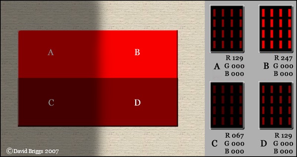
B appears more colorful, even though A, B, C and D all have the same saturation(!) B has higher Chroma. (c)Huevaluechroma.com
#2: Rythm
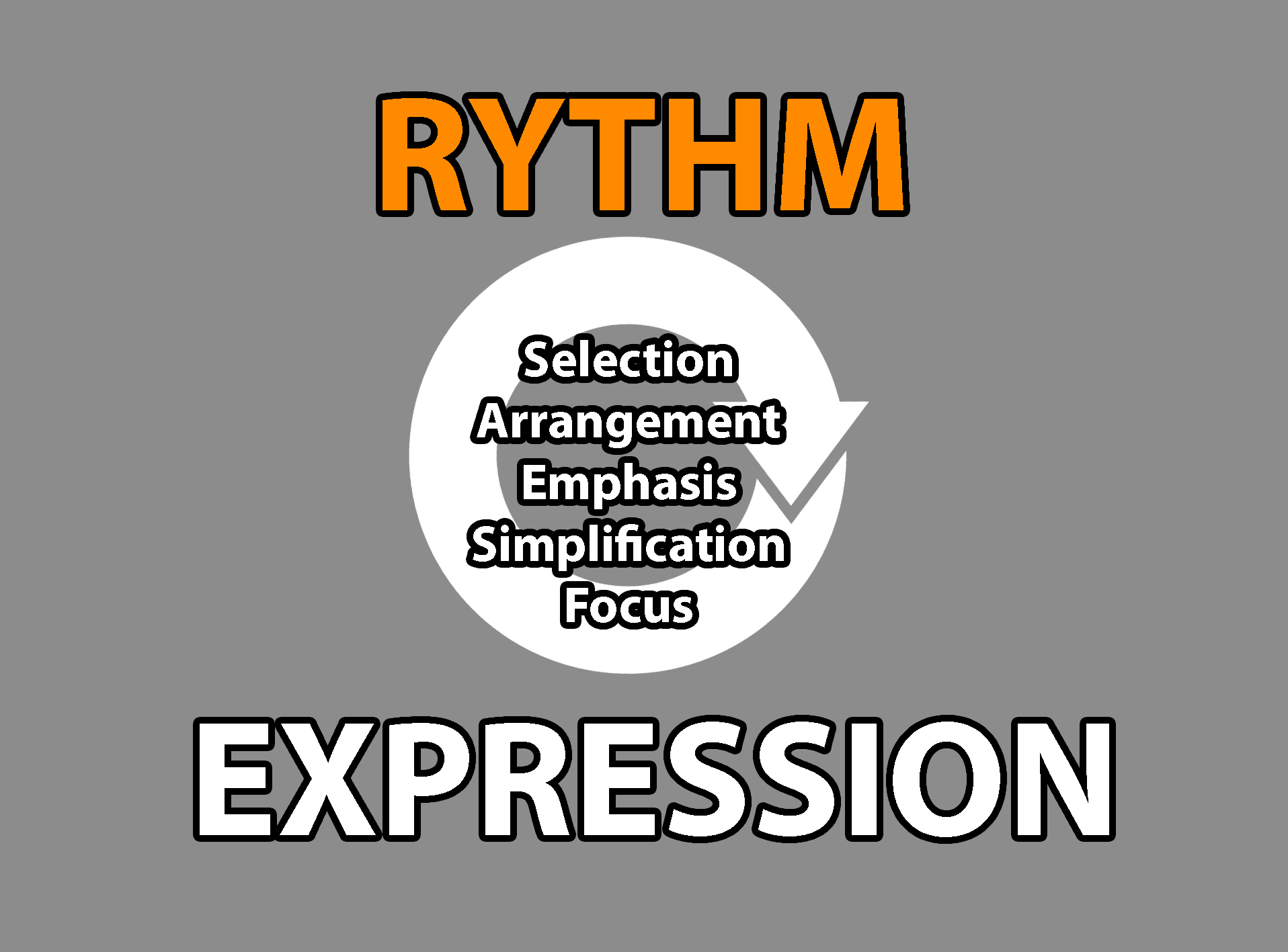
You paint things, because what you see moves you from the inside. Once you understand how to “play your instrument”(Accuracy) it is time to “write your song”(Rythm). If unconsciously or consciously, artists always selected, arranged, simplified, emphasized or exaggerated what they see. It is what they SEE in their minds. Everything you see is really processed by your brains, and these mental images can be changed and modified according to your artistic vision. Because you paint that mental image, it is so important to be accurate(#1). The goal of the artist is to elicit a strong emotional response in the viewer by using this mental image. All expression can be conveyed by the concept of rythm. If your painting looks funky, it is out of rythm. Your goal then should be to use the elements of rythm to bring your painting in rythm again. Rythm can be majorly studied under the form(Line) and shape(Mass) aspect. The “qualities” of rythm(according to Harold Speed) are: Variety and Unity. And if you are to study painting seriously, these two qualities will follow you along everywhere. Let´s divide them into the study elements: Unity and Variety of Line(everything related to form) Unity and Variety of Masses(everything with shapes, values, colors and edges) I encourage you to analyze a master painting for the same elements.
Study Approach #1: Unity and Variety of Line
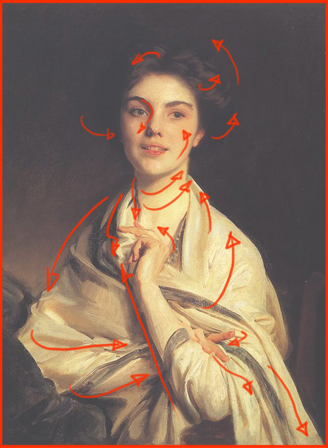
You can study the rythm of the lines for their unity and variety. In the example above you can see the rythmic flow of lines, and this is what make great paintings work, that focus in the beauty of form. Instead of only using straights or perfect curves, try to vary the curves to create variety(it should feel correct). There are endless varieties of how you can vary this and depending on the style you can even simplify the forms even more and create another set of unity and variety in the lines.
Study Approach #2: Unity and Variety of Shape
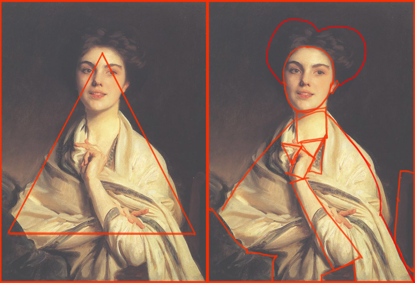
Now let´s look at the shapes themselves. Shapes are the most overlooked, because we are so used to draw the details of the forms in Pencil. With shapes you need to think differently. The best paintings use underlying geometric shapes to compose their image. We use geometric shapes, because it is human nature to organize and arrange things in a systematical way. Here, they are used as tools of expression. A triangular shape for example would convey power. Here, it is used to express prestige. Variety is created by using a varied set of shapes. Texture plays a huge role in conveying this variety. Shapes have a direction that can emphasize the line rythm.
Study Approach #2: Unity and Variety of Tone

Unity of tone is concerned with big value masses, so when you keep the tones simple, you will be able to convey a very harmonious expression. You create more variety by using higher contrasts of tones(contrast is just another word for variety). What is really important though, is to use values that are TRUE to the given light situation. In this painting, the values are fairly low-key and we have almost no light values.
Study Approach #3: Unity and Variety of Edges
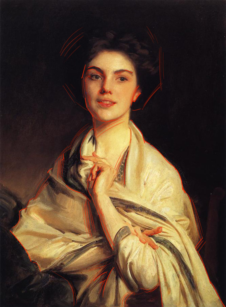
Edges are great tools to create rythmic expression. See how he uses edges to lead the eye around the image and creates variety in the painting.
Study Approach #4: Unity and Variety of Colors
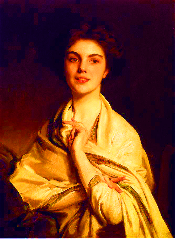
In studying the rythmic quality of color, you can look at hue and chroma separately. Above I have pushed the saturation to 100%, so you can see the hues better. You can see how Sargent uses warm hues as an united effect and balances it out with some variety by using colder hues(in the dark areas). Think in terms of relative hues or temperature.
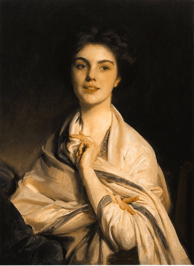
Here I evened out the color to one hue(Use new layer on hue mode and fill it with a color). What remains is the level of chroma throughout the painting. As you can see, Sargent keeps the chroma fairly low and only uses accents here and there.
Study Approach #5: Balance
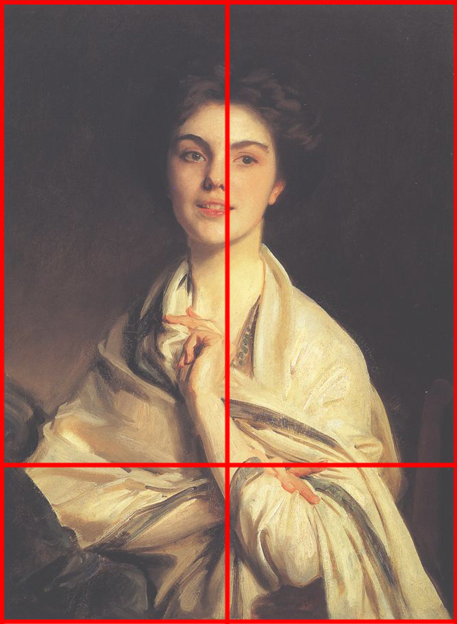
Two other elements of rythm are balance and proportion. And using those, you can create exceptional unity and variety in your paintings. Balance is actually a whole concept in and of itself. However, for simplicity let´s just study how Sargent used balance to keep the painting in harmony. As you can see, lines, values, and colors are all balanced out in relation to the center line that I have drawn in.
Study Approach #2: Proportion
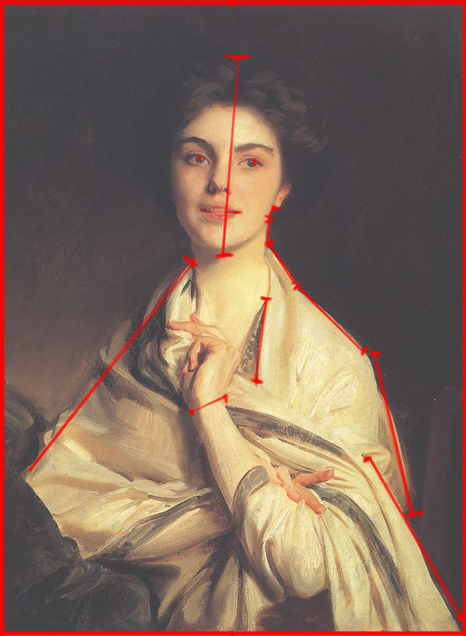
Proportion is also an important concept to create rythm. Study it for it´s unity and variety. Can you see how varied proportions make the painting livelier?
Conclusion
Notice that I didn´t talk about the subject much, because we are still mostly thinking about the perception and rythm side of painting. Accuracy and rythm will allow you to make better and conscious compositions, make color theory comprehensible as well as give you pointers on how to use painting as a means to draw better. The basics of accuracy makes the observation of lighting easier, because you are more confident in your decisions.